The perfectly round Os in toyota are the giveaways. I got them all correctly, except for MATTEL for which the only difference is the stroke width; and which I ended up flipping a coin for (incorrectly).
That said, I did get a degree in graphic design, so I may not be typical when it comes to this.
I picked the one with the longest distance between the T and the E. That was the wrong answer.
This quizz is an excellent training though. I didn't know anything at all about typography prior to taking the test (never bothered to learn the names of the fonts or their shapes), ended up scoring 17/20.
I have three degrees in CS, and I (correctly) answered the titular question with "No", and then proceeded to prove it with 10/20 on the button.
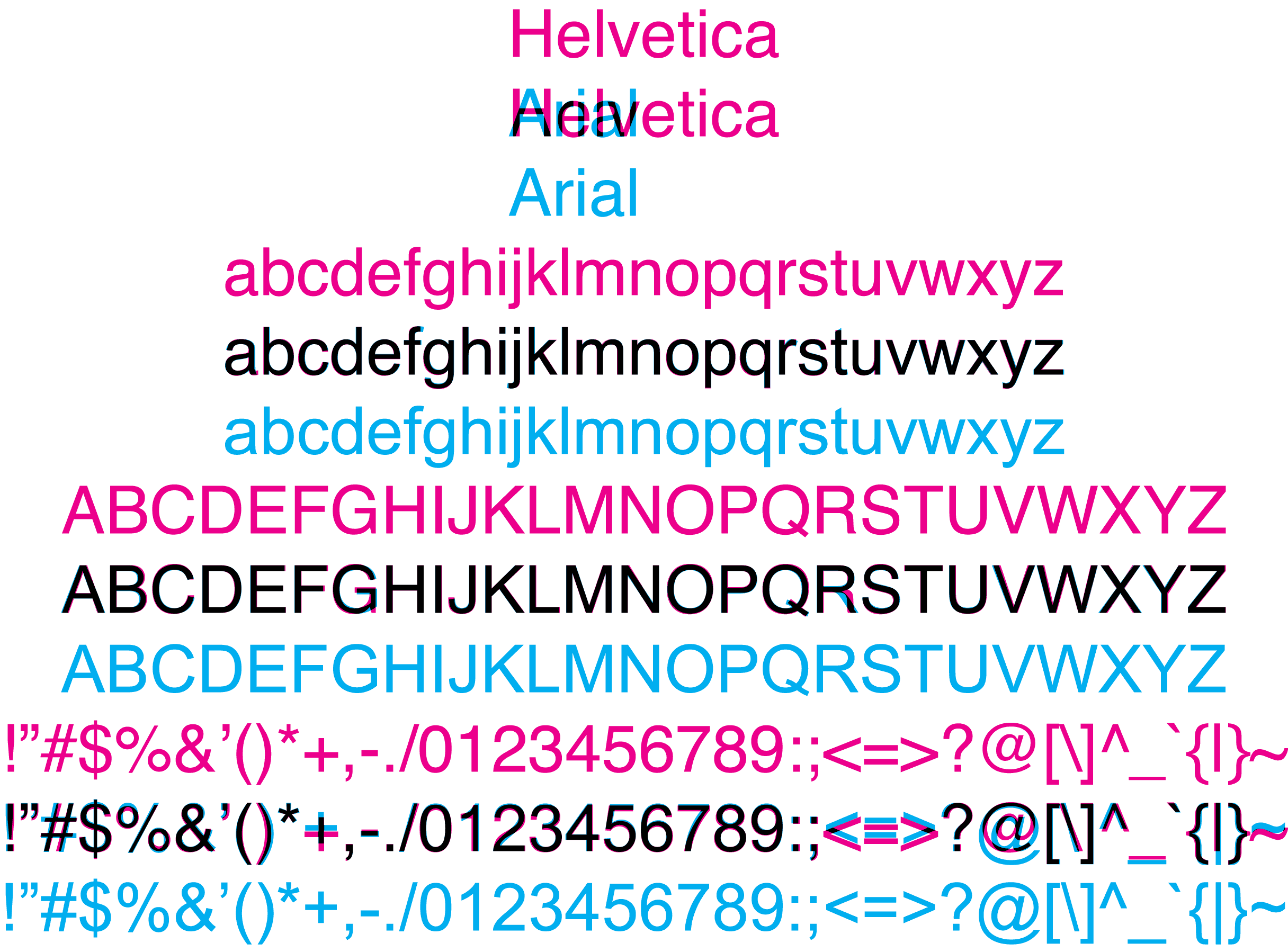
I notice the differences (slanted terminals, narrower "A"s, etc.), but had no clue which was which. Weirdly, I'm super-picky about typefaces, but mostly in a "I like what I like" sense rather than a "I know the precise details about why" sense. I dislike both Helvetica and Arial intensely, and so never bothered to learn much about what made them different. They're both just fonts I don't choose for anything.
I noticed the round Os in TOYOTA also -- for MATTEL, the height ratio between the top two and bottom two horizontal bars on the E is more even in Helvetica than Arial.
It should be true if the Arial examples were provided with comparable weights. That is, assuming, that the two fonts were weighted similarly from their base.
The perfectly round "O" was the giveaway for me. Helvetica just feels more "literal" to me, if that makes any sense, with its perfectly horizontal endings on "C" and "S" and "t", so the round "O" seemed more likely. Mattel nearly tripped me up too, but I noticed that Helvetica was bolder throughout than the Arial equivalent, so it wasn't hard.
O isn't perfectly round in Helvetica. The Toyota logo is modified to use perfect circles for the Os. The real O is a bit rounder than in Arial maybe, but still not a circle. Futura is the one with the perfect circles (for both O and o).
I used the same rational. Whichever font looked bolder, I choose and got it correct. Also, the Staples Arial version didn't have the "registered" mark so I got that one easily.
But in the Mattel example, Helvetica is the thinner font. Instead notice the varying letter width, the M being wider than the A with Helvetica in the Mattel example.
As the GP said, the caps on the S, C, T, etc were usually the giveaways.
The flourish at the bottom right (not sure the correct term) of the R in TARGET gave me at moment's pause. But each of the logos was customized to an extent.
I realised it must be Helvetica because of the "R". I reasoned thus: I am more familiar with Arial than Helvetica, and I'm sure I would have seen that "R" before if I were spending a lot of time with it because it's just so ugly, so since I didn't recognise it, it must be Helvetica. And I was right.
It's funny, because I universally prefer Helvetica over Arial otherwise.
You don't even have to know anything about typography. Without knowing anything about any typeface, after guessing and comparing the results of first few, I was able to nail 13 of 14.
I guess that anyone who knows anything about typography would answer correctly to all questions.
Clue: I went for bolder font. Also, Helvetica is a bit wider in these logos. After that, I also noticed the clue in C.
Same here, I had only MATTEL and TOYOTA wrong for that reason.
All the rest I had immediately, on the very first image there was 50% chance I had it right and I did a lucky guess, from then on I knew Helvitica was horizontal, Arial slanted.
actually a was bored after ten right answers or so. It was really easy. At first I only looked for what "looked better" because I generally like Helvetica but find Arial really ugly. After doing the first answers, I started to see the minor differences and now understand why I like Helvetica better.
The Toyota one is actually pretty obvious when you look at the O's - Helvetica O's are perfect circles, where Arial ones are flattened. As a Toyota fan, to me it makes a big difference. Arial is very unacceptable in this case.
In the Mattel example they both look kerned about the same to me (the A tucked under the T). Elsewhere in this thread it is pointed out that Helvetica uses varying letter widths and that's the only giveaway I see now in Mattel, though it's somewhat difficult to see due to the kerning. But the M is clearly wider than the A with Helvetica.
In the cases with capital A's, you can tell by the spacing between the two "legs" of the `A`. Helvetica is more compact. The space inside `O` is more compact for Helvetica as well.
There are obvious tells in almost all of them -- mostly lowercase "s", "c", etc, in which Helvetica is has perfectly level edges and arial is angled.
The only harder ones are some of the all caps examples like TOYOTA.