It looks like someone getting good at illustration. Older icons are far better illustrations. However icon design is not just about illustration, it's about clarity and affordances. Icons don't exist in isolation like an illustration, they exist alongside the rest of the UX and other app icons, and being recognisable is important.
All that to say, the sweet pot was likely somewhere in the middle of this timeline. The earliest icons aren't recognisable enough as they're too illustrative. The later icons aren't recognisable enough because they're too basic. The middle are pretty, clear from colour, clear from shape, well branded.
I spent half a year designing and creating 200+ icons for a custom geospatial mapping app. I really enjoyed the work but it was grueling and tedious, especially the design part. Too many people had too many different opinions on which symbols meant what, which styles clearly conveyed ideas without being too detailed, and many other things that kept wasting my time and causing a lot of rework and inconsistencies. It was literally just me doing the work, so I stopped trying to get consensus and took a few weeks to redesign the entire set and even used color science to inform my design decisions. I created the entire set without external input, then presented it. Sure there was some tweaking here and there, but I believe it turned about to be great and no one really complained in the end. The most important part was that end-users were happy. I used Inkscape and developed a set of scripts to automate the build and had everything in a very organized Git repo.
Consistency sells but is really hard to ensure in time bounded series of narrow discussions with changing participants. But this must not discount the value of the preceding often frustrating search for understanding the requirements and prototyping. Throwing away the prototype while all the lessons are still in the head can yield great design.
In feedback solicitation situations with multiple stakeholders, it's important to attach cost to suggestions. Consulted without being responsible is always a dangerous offering.
Not in the sense of "This is how long that will take me" (because who cares about someone else's time?), but in "Of the 3 things you requested, which 1 is your must-have?"
Often this is approximated via design/dev team pushback, but it's easier just to be explicit about it: i.e. everyone gets X change request tokens.
This is why, when you've got a bunch of geeks deciding on where to go for dinner, someone has to say "We're going to the Jewel of India" and herd everyone out that way. If you don't do that then it'll be 11pm and people are still pulling up restaurant reviews and arguing over whether the one that got 4.3 stars really is better than the one that got 4.2 stars.
This is also the difference between a supremely dysfunctional and an OK-ish standards committee, the classic Home of Bikeshedding.
You can't say "no" to a restaurant without voting "yes" to an alternative. The first restaurant to a majority wins. Is it a perfect system? No. Do I get to eat in a reasonable amount of time: yes.
That's just like hiring McKinsey et al - the true value isn't the advice itself, it's probably been written down by some poor intern working 80 hours a week yet billed to the client as "director" time, the true value of why these consultants still get hired despite their truly abysmal track record is that management can use that "external advice" to cut through red tape and plow over internal resistance.
LLMs however... they give part of this power to lower levels as well. After all, what is an LLM other than the condensed knowledge of humanity? (Partially /s)
This was about 8 years ago and I am not sure I ever retained a local copy of the repo. If I find it, I’ll resurrect it in a public Github repo unless there’s some NDA/IP issue.
Apple has the benefit of massive cash-flow and, as a result, hiring many competent designers who draw and create to a specification. The specification could be created by another team of senior designers that are paid handsomely to deal with the gruelling task of defining a corporate identity.
This is similar to how major feature cartoons, which typically require variations of an image to be drawn over and over again, are typically animated by more than one person.
I.e. Apple has the money. They can do better than having one extremely hand-cramped illustrator crank out silhouette-style icons.
I am partial to the relevant icons in FontAwesome and these days the Bootstrap icons. I think the silhouette of a generic, androgynous portrait universally gets the idea across nicely.
I definitely needed the initial input from the stakeholders as to what they wanted and why, but it turned into pointless bickering about colors and many disagreements about symbol meanings - for example should a dropped pin have a shadow? Should it be pin or a baloon-like thingy? Should it lean left or right? How does one represent a “duty station” when there is no previous iconography or other kind of standard around this? It also led to a lot of design-by-committee meetings where well-intentioned people suggested good ideas but things were always left at some ambiguous action item that never had any follow through. This took months and I kept re-rendering the icon set (which were all multi-layer SVGs) and then pasting the PNG renderings into a Word doc because that’s how they wanted to review them.
What this did teach me was to create very efficient workflows. I had all the Inkscape keystrokes memorized and found out they had an API that allowed me to create some level of automation (things like batch conversations IIRC). I kept certain symbols as separate base/template images so I could quickly swap things in and out. I had separate color files with swatches of various color themes, all in hexadecimal. Since I was and am fundamentally a software engineer, I used those engineering processes and principles to make it more like a typical software project than just a collection of images.
This is one of the many reasons I do my own projects. I do value the opinion of people without knowledge and experience, but I don’t want to feel obligated to make them feel I did what they wanted.
Designer here: there's a trade-off between visual harmony (all icons look the same) and ease of differentiation.
A standardized container adds regularity to irregular shapes.
Recently, Apple has been heavily opting for visual harmony, so their icons look consistent when seen as a set. Google too. It's an industry trend that is fairly annoying.
Non-designer here: The bounding container being consistent signalizes "this is an App," which is helpful in the broader context of an operating system. For example, if I saw this on my file browser, I'd have to think if it's an App or a document: https://upload.wikimedia.org/wikipedia/commons/thumb/9/9e/Li...
That first level of signalization builds on top of familiarity with iOS. The squircle signifying app shows up a lot, even in marketing materials for iPhones and iPads.
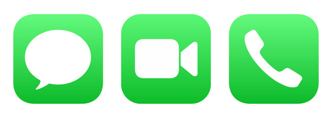
Once you're past that first level, you can use the shape inside the container. The Phone and Messages icons are just green squircles, right? Yet they're very distinctive, because the interior shape (phone handset, bubble) is what registers. https://t3.ftcdn.net/jpg/17/71/51/32/240_F_1771513287_ATNuUv...
Mac OS and iOS thumbnails documents/files for icons on the file browser and search, so shapes are irregular. E.g. Landscape thumb for a .pptx, square album art for an .mp3, portrait for a .pdf, arbitrary shape for a .xlsx. 3rd party apps can participate in that through Quicklook plugins.
It's a great feature because I can scan several files named export (n).xlsx on my downloads folder stack, and know which one I want from the thumbnail alone. OS feature improvements change the design context.
>A standardized container adds regularity to irregular shapes.
Does putting differently shaped icons in a standardized container make them harder to distinguish? When I look at an object its boundaries register first. If all icons are enclosed in the same square container, then they all look like squares at first glance.
But is it simply trading actual concrete functionality and usability in exchange for the concept of "superficially looks nicer to certain people in a marketing image" ?
I think this spectrum shows the issues with that though. Take the last one, the pen pot. You truly have to _learn_ what that means. Pen pots aren't a thing that most people are familiar with (I've never used one, I don't think my parents generation did mostly either), and there's little explanation of what it is.
Move up just one previous, and you've got a good looking illustration still, the pen and paper, but now a) everyone knows what a pen and paper look like, b) it literally says the name of the app, and c) the yellow colour scheme distinguishes it well when scanning many icons. It's clearly more accessible to new users, existing users, young and old users, and in terms of illustration quality, seems pretty subjective as to whether it's better or worse than the last one.
I’m not convinced the pen pot needs any more learning than anything else. Even the ones with the paper - is it a word processor, emailing tool, something about newsletters? Maybe a PDF or markup tool? Or a layout tool for print media? Or just a signature tool?
At some point, the user has to find out, in the same manner they find out about the pen pot.
I think users could easily associate the “pen and poison potion” with word processing for years until someone says “click on the pen and ink” and then they have a lightbulb moment.
I think we went from icons being “visually distinct” to “visually descriptive” to “visually uniform”. Personally I prefer the visually distinct. I’m not convinced we gained some massive leap forward in usability moving away from it; I know I struggle substantially more to find an app or tab that I’m looking for nowadays than when I first got a Mac.
> Pen pots aren't a thing that most people are familiar with
Personally, no. Cognitively? We've been seeing quills and ink in children's stories for centuries. One doesn't have to have used a bubble level to get the analogy in the iOS Level app.
> pen and paper, but now a) everyone knows what a pen and paper look like
A quill and ink are conventionally portrayed in relation to writing. A pen and paper could refer to e.g. sketching.
I'm obviously nitpicking. But I reject the notion that we have to oversimplify to the degree you're suggesting.
> it literally says the name of the app
The OS does this almost everywhere apps exist. Putting the name in the logo is superfluous.
My issue is not that if icon represents what the application does but they all look alike.
The old school icons, even if they were not good representation of what applications did, were distinguishable from a distant. Once you memorized the icon, you would easily find it, on your machine or someone else’s. Even on very crowded desktop, each icon stood out.
I think that is the flawed conscious reason for these icons getting excessively oversimplified and minimalistic. And why the Save floppies were replaced with inconsistent crap. And some higher-up at Apple's severe untreated OCD is the reason for the excessive uniformity (squircle jail, one saturated dominant color, the geometric "grid system" they keep bragging about at keynotes). Look at old Launchpad screenshots from OS X Lion and you'll see what drove that guy nuts and made him ruin every icon.
I showed this timeline to non-technical people around me and they prefer... the original pen pot.
Having distinct icons is nice. People can learn. It's cool to have cultural relics live on in some way. My kids recognize the floppy disk as save, but they have probably never seen one in real life.
I think images and representations of no longer used artifacts still live on in our cultural knowledge. They don't necessarily have to be a part of everyday lives. Think of children's stories and fairy tales. I don't see swords and shields in every day life very often but I can recognize them easily. I've never seen a komodo dragon in person but could recognize one if walked down my street.
As someone who still misses the skeuomorphic design of things like "Books", the first icon is dramatically more expressive than any of the others.
These days I do a search for an app by learning its colour, and using that to narrow down the options. There's much less visual associativity of "this icon" === "this app". I really oughtn't have to execute a hash-table search just to find the damn app I want.
>I think this spectrum shows the issues with that though. Take the last one, the pen pot. You truly have to _learn_ what that means.
Not an issue. You learn it once, and then you instantly recognize Pages every time, due to its distinctiveness from all other app icons (and the same holds for each of the others).
You will be looking to click the Pages app among other apps (in a launcher, Applictions/ folder view, alt-tab app row), etc, for many years. You'll only need to make the discovery/association once.
The new one is just some lines over a background, and you'll have to pick it in a sea of other icons that are similarly 2-3 lines over the same background.
Older versions of MacOS had an elegance to them. It’s lost some of that over the years.
The overall trend towards minimalism has ironed out much of what made it unique and it hasn’t always succeeded in improving UX. Even Liquid Glass and the ability to tint the icons (to make them even more indistinguishable) depends on the detail being kept to a minimum.
Yeah, what's amazing to me is that they play with the icon so much in an environment where they expect people to find the application by its icon. I always set up my machines so that I use a launcher that allows me to type the name of the program and then press Enter because I hate searching through grids of icons to find things, especially when the icons change over time. But when the company itself is expecting people to find things visually and then constantly changes the visual landscape, it just seems egregious.
I agree with your conclusion that the sweet spot is in the middle, because I could easily explain to my mom "click the icon that has a pen and paper" and it would be very obvious. The current icon is completely ambiguous crap.
The current icons really aren't that good. Looking at apple specifically: The facetime and messages icons are almost completely indistinguishable. Get angry and say I'm blind, but so is a lot of the userbase - like legitimately, legally blind people.
The camera icon on iOS is just a fucking camera lens with a grey background. No context.
Sure, but it's not clear they're unrelated. Maybe interesting is necessary (but not sufficient) for usability?
Also, the newer icons don't really indicate a word processing application. If anything, they're look like they might be for a drawing program. So regardless of interesting/abstract/whatever, it seems like a poor icon choice.
The ink pot one tells me it's clearly an Apple's app. Though I might not know what it is, I know it's likely Apple's.[0]
The new ones can be a random app that shows up in AppStore when you search 'note taking' or 'todo list' or whatever.
I'm also strongly against the idea that an icon needs to directly tell you the functionality of the app. Photoshop's icon is literally 'PS.' Twitter is (was) a bird. No one thinks they lack clarity.
[0]: of course in this AI era if the retro detailed illustration comes back, everyone will just generate their icons in that style... it's a battle you can't win.
None of the Pages icons are recognisable because almost no one uses Pages. The word icon is just a blue W which is not any more illustrative than an orange pen.
The office icons are rather subtle but do sorta illustrate what they do if you look carefully - the word icon is a list, the excel icon is a spreadsheet, and the powerpoint icon is a pie chart.
That you have to look closely is kinda crap lol. Whoever designed the icons was more obsessed with consistent branding instead of making icons that make sense.
Looking at the start menu, some MS icons are great. Paint, Notepad, Calculator are all fantastic.
I dislike MS as much as the next guy, but it's the Office mobile app that was renamed to Copilot 365. They haven't yet thrown away the entire Office brand
Just like Twitter is now X, full stop? With the difference that the "Office" brand is much older and has much more staying power. Besides, the desktop application suite is still named the same AFAIK.
One of my favorite series is Nathan Lowell's Solar Clipper... in In Ashes Born, there's an bit about creating a logo for the company...
    He pointed to the far end of his studio. Two tiny patches of white—which were probably actually gray—lay in a single pool of light. One was a smudge of red and the other was a spiral of red. “Which one of those is your logo?” he asked.
    “Neither,” Pip said.
    “The smudge,” I said understanding where the kid was taking us.
    “Right,” he said. “The smudge.”
    “What?” Pip asked.
    The kid held up the paper from the workbench. “Look, this is nice and all, but it’s too fussy. If you look at anybody else’s logo, it’s not fussy. It’s iconic. A crown with wings. A C in a circle. That’s yours,” he said to Pip. “All of them are simple shapes combined to form an unmistakable pattern.”
My own choice for a gavatar is similar - https://github.com/shagie (it's from a photo I took). While by itself its a neat bit, its also something that is easily recognizable as "that's Shagie's" when its projected on a screen on the other side of the room or if it's someone's full screen share and everyone's icons are shrunk down to smaller blurs - mine remains clearly distinct.
The goal of an icon is to be able to identify it quickly without having to read the associated text.
The inkwell and the two with the paper are artistic - but they aren't things that stand out quickly when you're trying to find them in the launchpad or on the sidebar.
Pages is orange. Numbers is green. iTunes is red. Keynote is blue.
For Microsoft, Word is blue, Excel is green, and Powerpoint is orange (and Outlook has an envelope like shape). The letter reinforces the choice, but that's more of a hint and reinforcement.
The shape and color is the important thing for quickly finding what you're looking for.
Document, pen, orange, and name "Pages" is pretty excellent all round for recognisability in my opinion.
Over the years Word/Powerpoint/Excel have done similar things, they have their own colour, their own name/letter, and usually have had a descriptive graphic in the icon too, indicating a document, grid, or slide.
OS X had a lot of icons that were detailed illustrations but you‘d only see it when you zoom in. Yet they also worked as small icons. You can have both and Apple did. The textedit icon is a great example.
I think it depends on size. If the icon is very small, I like the simple ones. If the icon is large, I like the detailed ones. Optimally, you can have an icon with more detailed versions when displayed larger, but it remains the same icon.
The new one, orange pen on black background, to me looks like a blacksmith hammer or a welding torch.
I would not associate it with writing at all.
2, 3, and 4 (from the left) look like they're for a notes app rather than DTP.
5 and 6 tell me what the app is for.
7 looks like an art app, not writing. I favour skeumorphism, but to work that needs to use metaphors people are familiar with, and pots of ink are something I know only from art stores.
I actually had to try to zoom in on the older, “ideal” example shown, just to see what it is.
Yes, my eyes aren’t great anymore. Yes, I’m on my phone looking at a social media post. But I feel like the speed and clarity of the newer ones was (accidentally) on display here.
I use macOS and have done so for several years. But I had to look up this app icon to know what app it was. It’s the Pages app, which I don’t use and don’t keep in my dock. Looking at only the leftmost icon, I was thinking it might be the Notes app or the Freeform app, both of which might conceivably also be represented by what to me looks like an Apple Pencil for iPad.
Looking at the reminder of the icons, I recognize that it’s not the Notes app because although I no longer use that one I have in the past so I remember that it has looked like a notepad with some lines and some yellow on it. But the leftmost one might as well have been a newer version of Notes than the one I last used.
Anyone who thinks an intricate illustration of a quill and ink communicates to the user "Hey this app is our Microsoft Word"...is not thinking about what function an icon is supposed to serve.
It's like comparing a road sign to an 18th century painting and saying "LOOK HOW FAR WE'VE FALLEN!"
The quill and ink at least communicates that it's about writing. The new one is so abstract that when I first looked at it I had no idea what I was even looking at, it certainly doesn't communicate "this is like word" to me. Without comparison to the previous icon, how many people do you think would understand that the bottom line is intended to be a stroke drawn by the pen?
I think you might be post-hoc rationalizing an emotional feeling, as clearly this meme is emotionally triggering to everyones nostalgia/pessimism nerve (hence why it went viral).
I'm 100% positive more people would guess the far left icon is a text editor compared to the far right icon. Not that I like the left icon aesthetically. Both are pretty weak icons.
Leftmost is probably a pen, rightmost is definitely a pen and specifically a fountain pen. I've never seen these icons before, and I'm trying to be the fairest I can, and I think rightmost wins at evoking "text editor". But the one exactly in the center wins by a mile. Pen on lined paper, hard to do better.
Same thought.
The one on the left just conveys "notes" to me. Middle actually seems to be about a more "well put together" document. A fountain pen by itself doesn't necessarily mean documents to me, but signing them.
As the icons progress to the left, identification increasingly depends on colour and shape. Since there are a limited number of colours and shapes, they tend to get reused. This increasingly leads to mis-identification of icons.
This is particularly true for the visually impaired and some elderly and neuro-atypical people.
What matters in an icon is uniqueness. Only the skeuomorphic icons to the right can be unique enough for proper identification.
Trendiness of visual appearance has no place in the functionality of a complex machine. If you think it does, I submit the following for your consideration: you. are. a. monster.
Yes, I said that and I mean it. You followers of Jony Ive and his ilk are assholes. The rest of us don't give a shit about your design schools. We just want to be able to click on the right thing.
> identification increasingly depends on colour and shape.
If only they would stop there. These design terrorists won't even let us have that much; Google's Android apps all use the same 4-color-rainbow scheme. Not only did they get rid of the ability to visually identify the icons by color, but you can't even really identify them by shape because applying four highly constrasting colors to a simple shape breaks up its silhouette into something that is not quickly recognisable at a glance. It's as though they're intentionally trying to make the icons have as little functional utility as they possibly can.
Google's icons are actively hostile to usability. I honestly found myself using their apps less because I couldn't pick the one I wanted out from the rainbow soup.
The worst part is, when computer screens were monochrome or had only 16 colors, (and perhaps 16 pixels a side) to work with, designers managed to create more distinct icons or pictograms. Perhaps they may not have looked as elegant as a set of items on a collector's display case, but they helped the end user quickly zero in on the part of the screen they were interested in.
> This is particularly true for the visually impaired and some elderly and neuro-atypical people.
The Slack and (Google) Photos icons on Android look so visually similar in the sea of green, blue, red, and yellow icons on Android that I frequently open the wrong application. Using my phone sucks.
Not sure if this will help you, but I keep just one homescreen page with my most-used apps on it, and I've developed muscle memory for all of them. When I set up a new device, I put the same apps in the same spots. Other than the inherent inaccuracy of touchscreens, I could probably open any of them blindly. I also only fill up the bottom half or so of the screen, so they're all easy enough to reach.
I don't know if you can change the icons with the default launcher, but you can with Nova Launcher. I changed pocket's icon to a taco. Not to make it visually distinct but because the placement of the icon on the background made it look like it was going into someone's mouth and I thought it was funny. Anyway, opportunities exist to improve your phone experience without needing to depend on Google to come to its senses.
It's not true. This is just a natural process in technology. Look at oracle bone script. Over time people simplify for expedience, but only because they knew what came before.
Here simplification is used to increase the set of people who understand the meaning of the symbol. Understanding the meaning of a symbol is the foundation of language. I'm sorry you are disabled, but you are the monster for trying to hoist your disability onto everyone else.
Oh hi everyone! So funny to see how my quippy little tweet blew up the last few days on all the platforms (much more than when I share actual things I make, to my great dismay - if you're an artist/photographer, check out my apps & tools: https://heliographe.studio).
There's lots of interesting discussions to be had around what makes a great icon (but social media platforms aren't the places to have those deep conversations). For example the original Mac HIG says that an app icon should:
- clearly represent the document the application creates
- use graphics that convey meaning about what your application does
The first point might be a little outdated, as we tend to live in a "post-document" world, especially on mobile. The second is broad enough that it holds up, and under that lens it doesn't seem that an image of a pen/stylus is most appropriate for a word processor app.
By that metric, the Mavericks/Catalina (5th and 6th on the linked image) seem like the strongest icons. The Big Sur (4th) one isn't too bad given the "must fit in a squircle constraints" that came with it, but it starts to feel less like a word processor app icon - it could as easily be an icon for TextEdit/Notes.
The most recent 3 are very hard to defend - the main thing they have going for them is that because they are simpler and monochromatic, they fit more easily within a broader design system/icon family. Even then, the simpler shape doesn't make them more legible - a number of people have told me they thought it was a bandaid at first, or maybe something terminal-related for the orange on black one. The "line" under the pencil (or is it a shadow?) on the most recent one is almost as thick as the pencil itself, and blends with it because gestalt theory.
I agree that the 7th one (original ink bottle) has a few issues that don't necessarily make it the best choice for an icon - but dang, the level of craft that goes into it makes it an instant classic for me. And it does retain a fairly distinct, legible shape that still makes it a solid icon even if the detail gets lost at smaller sizes.
Icons need to be quickly recognizable, but at the same time an icon is not a glyph - and illustrational approach do have their place. Especially on devices with larger screens where they are going to appear quite large in most contexts.
The big elephant in the room with all this is that icons 5/6/7 clearly take more craft skill to execute than icons 1/2/3, and Apple used to be the absolute reference - no debate possible - when it came to these matters. As a long time software designer (and former Apple designer myself through the 2010s, although I was on the hardware interaction design side, and not making icons), it is sad that this is no longer true.
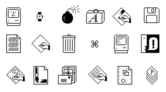
I grew up with Hypercard etc. and always loved the classic icons, like these: https://99percentinvisible.org/article/designed-with-kare-in...
Don't suppose you've ever extended the timeline further back? I bet there would be some interesting discussion!
Between this, and icon-only toolbars and ribbons, I think we're reinventing Chinese, badly. Ideographic characters can often convey meaning succinctly.
My vote is to either go back to picture icons, or use Chinese characters with localized pronunciation, so 車 or 车 is car, and so on.
Just like most software icons are not legible without prior knowledge like arrow down mean to save, a circle with a line mean power on/off, etc. Both are ideographic, and I guess some software icons might be a bit more pictographic (like a cogwheel meaning settings because you are interacting with the machine).
Incidentally, the largest group of Chinese characters are phono-semantic e.g. encode both meaning and pronunciation. Over half of all Chinese characters are in that bucket. That actually allows speakers to have some ability to guess both pronunciation and meaning of characters they have never seen. There are rules to guide this.[0]
In Classical Chinese actually. Mandarin, which I assume you mean, is not the language these characters were designed for. But it is related enough that the phonetic hints often (but not always) help.
That might be a better word to use, maybe. But I'm not sure there was an adequate word for the point I was trying to make.
The linguistic definition of ideographic is that it is a language which uses symbols to represent concepts, rather than just literal pictures (pictographic) or sounds (alphabet or syllabrie).
Linguistics textbooks as far as I'm aware do not define symbol in this context, but generally a symbol seeks to represent the concept. Emoji are great symbols - you see an emoji and you largely understand its meaning, even if you have never seen it before.
The modern Chinese writing system is so abstracted that even an otherwise highly educated person that just lacks exposure to Chinese written script would have absolutely no idea what any of the characters mean. 一, 二, 三, sure. Beyond that, no fucking clue.
So yeah, they wouldn't be legible. Because as symbols, they objectively suck until you learn the basic components, structure, and patterns of organization of the characters.
So to the extent that an ideographic language conveys words as ideas through symbology, and to the uninitiated these symbols lack all meaning, it's not really ideographic is it?
But yeah, not legible might have gotten the point across better.
> So to the extent that an ideographic language conveys words as ideas through symbology, and to the uninitiated these symbols lack all meaning, it's not really ideographic is it?
If I write math equations in an unfamiliar and inscrutable notation does that somehow make them "not math"?
I don't think ideography is in the eye of the beholder but rather the creator. Using the uninitiated as your standard doesn't seem to work very well for most things beyond the absolute basics.
The key observation here with relevance to the original topic would probably be that icons that are legible to the uninitiated are likely to be of benefit. Even if you don't really care to accommodate them it's still going to help you to get your choices adopted.
Thus an amusing thought occurs to me. If we did want to switch to Chinese characters for icons it would probably make sense to do so gradually, one app every six months or so.
Many characters aren't ideographic at all. Nothing at all about the structure of 的 (genitive case marker), 是 (be), or 有 (have) hints towards their meaning. A number of others like 好 (good) are ideographic only through convoluted and unintuitive etymologies.
Icon - Ideographic character is a really interesting connection I've never seen made before that seems to capture what is going on. Don't agree with your conclusion to "use chinese characters" though. I don't think it's easy to tell what they depict.
Apple was never keen on customization, and instead they wanted to offer a good experience out of the box as a package (take it or leave it).
The problem is that Apple has lost good taste and judgement. And their App Store obsession turned "we've made it so simple you don't need to customize it" into "you're not allowed to touch our precious OS, you additional-service-revenue-dodging bastards".
> Every single one of these icons should be available to choose by the user.
They are. You can replace the icon of any app straight in Finder, in the Get Info window. Copy the icon from somewhere else, click the icon in Get Into to select it, and Cmd+V to paste.
I mean, you'll need to get the original icon, but that's not too much work. I don't think Apple themselves should be shipping every high-resolution icon they've ever used for every app. OS's are already large enough.
I've attempted this for the brave browser, which has a horrible icon in my opinion. It works but the original one self-restores after some time, even without updating the app.
No, unfortunately it doesn't. I've also looked for a way to script this and came up empty handed. If somebody knows how to programmatically set a custom icon for an app or arbitrary file in macOS, please speak up.
Plex does - if you give them money. A lot of app packages offer customizable icons provided you give them money for the privilege.
I disagree with this approach, and vendors that lock such changes down. If a user wants to replace every single app icon with a PNG or SVG of their choosing, that should be permissible at the OS-level. Users should always have the final say over their interface choices, and corporate or software-maker changes regarding aesthetics/interfaces should never override what the user has chosen for themselves.
Right now there's strong overlap in interfaces and experiences that make this difficult, if not impossible to execute on. Separating the two again is critical for computing to be accessible to all, as is maintaining a consistent experience throughout interface changes.
Why are people arguing that icons should be intuitively tell you what the app is about? Since when was that the goal of an icon (in paritucal an app icon)? It should be easily distinguishable from other icons. If I don't know what the icon means it will take me exactly 1s to find out by clicking on it, after that I will know what the app icon is for, and I only care if I can distinguish it easily from other icons, so I don't accidentally start a different app.
I strongly agree. But (having just replied to someone else about ideography) it leads to an interesting thought. Once you learn them the app icons become a shared legible writing system. Going to drive to the store? Go lang, Google Drive, Play Store. You get the idea.
It's a trademark violating abomination but I think we ought to give it a try.
But... your point is valid. I didn't interpret the original comment as being limited to app icons, but on another read you are right; it does emphasize them.
Apple's guidelines have long been flouted by Apple itself, not to mention that they're replete with stupid ideas.
I've developed a few iOS apps, and one of my favorite Apple "guidelines" (which they essentially enforced at the OS level without developer choice) was that, upon launch, your app should show a fake UI while doing startup tasks in the background. The recommendation was part of Apple's admonishment against splash screens. Think about how dumb this is, and how it makes your app look inept. Apparently plenty of developers did, and shunned this dumb idea; because Apple then forced it on developers whenever technically possible.
Upon your app going into the background or being kicked out of memory, Apple will take a screenshot of what your app is showing. When the user returns to your application, Apple will present this old screen shot; but none of the controls on it will work. The user can tap away furiously, but nothing will happen. When the app returns to functionality, the screen will be replaced by the real UI.
The problem here goes beyond ineptitude into a major privacy issue. You can think you "closed" or changed what an application is showing before handing your device to someone, only to find that Apple still shows a screen shot of its old contents in the open-apps stack. This could be a disaster.
I like the older icons so much more. I'm not in so much of a rush that I care about icons making it 2ms faster to differentiate and click the right thing. I want some character and some love in my GUI. I want different components clearly laid out, I want scroll bars. Favourite GUI, Windows 95 and Snow Leopard.
There are many complaints about "modern" logos being illegible and how it is impossible to guess the purpose of an app from the logo and I do not understand it. There was never a period of time when you could just look at any logo and know what it is. Just to name a few examples here
- Photoshop (used to be an eye, was briefly a feather, now just the word mark PS)
- Foobar2000 (Alien???)
- WinAMP (lightning?)
- Google Chrome (I never figured out what it was supposed to be, just a ball of colors?)
- Microsoft Word (what does W mean?)
- Microsoft PowerPoint (look at the office 2000 version of PowerPoint, it has a pacman in it)
- VLC player (what does a traffic cone have to do with playing video?)
I think if anything has changed now and then, it was not how comprehensible logos became, but how cynical we ended up. We seem to have developed a knee jerk reaction to find anything about "modern tech" to hate on (on a forum owned by the company that funded much of the modern tech nonetheless) and it had colored our perception of how things really were in the past.
Those icons were incredibly visually distinct, despite being meaningless. I still know exactly what they are for instantly, in my peripheral vision, years after using many of them.
Modern icons are not only not comprehensible but not visually distinct (Tahoe making everything the same shape, many apps removing all colour from toolbar icons, various distinct if anachronistic symbolic icons like Save being replaced with slighly different orientations and arrangements of arrows and rounded rectangles...).
This severely impacts the efficiency of user interaction, especially after the first time you use something, at least for me. It's not a knee jerk reaction, it's a reaction to actually feeling it becoming harder to use my computer.
> There was never a period of time when you could just look at any logo and know what it is
None of your examples are for built-in applications. You have to go out of your way to download those programs. You'd know what the traffic cone means because you downloaded the program with the traffic cone. You went out of your way to get it.
Let's go back to that era and look at some other built-in apps, like Pages is (these days).
Notepad: a blue-covered notepad with some lined pages visible.
Wordpad: a fountain pen writing on some lined paper. Eventually the pen disappeared but the paper remained.
Paint: a paint palette, then a bucket of art supplies, then a glass cup with paintbrushes, then back to a palette but with a brush.
Solitaire: a deck of cards.
Outlook Express: an envelope.
MSN Messenger: two people next to each other because they're communicating with each other.
Windows Movie Maker: a film reel/strip.
Internet Explorer: a big 'e' (for Explorer) with a planet-like ring around it, suggesting a planet that you could traverse. (Okay, a bit abstract)
Over the Mac, there was:
SimpleText: a pencil writing on a sheet of paper. Later re-used for TextEdit.
Sherlock: a detective's cap and magnifying glass, indicating searching. The magnifying glass was later re-used for Spotlight.
Disk First Aid: A floppy disk on the back of an ambulance.
Disk Utility: a doctor's stethoscope pressed against a hard disk.
etc.
> it was not how comprehensible logos became, but how cynical we ended up
Because, on macOS, none of the icons became any more comprehensible than before. If anything, they got less comprehensive even when the visual metaphor remained the same because the representation is so poor. That's what made everybody cynical.
I'm sure design theory says the new ones are better, but the very first one was much clearer for users. Also on the phone I could say "click on the ink with the pen".
There are basic principles of design -- of balance, emphasis, color, weight, etc. -- that are very much part of a general "design theory". That aren't dependent on any particular school of thought.
I feel like this is actually quite a bold claim. Just within this thread there is wild disagreement. The term “design” is so insanely broad. There are Dieter Rams-style principles of functional objects that have sort of “won out”, but with graphical design, it’s essentially art, it’s all so subjective.
I remember growing up with Apple computers, even the black-and-white Macs were easier to understand than today's nonsense, with its "liquid glass" and hidden modes like scrollbars that suddenly appear.
Kid Pix was for kids. Kids could understand it. Easily.
Macs were easy to use and understand. What happened? Steve Jobs passed away, that's what happened... and everyone stepped up to "make their mark", first of all Jony Ive.
That icon is pretty terrible. Fountain pens were obsolete 50 years ago and ink in bottles is even more outdated. What's with the shiny spherical bottle? It feels like a hipster icon design to me.
Of course picking a meaningful icon is trés difficult.
If we are given the name and then we learn the icon, then perhaps it doesn't matter too much what the icon is?
> Fountain pens were obsolete 50 years ago and ink in bottles is even more outdated
My friend, you have no idea what you’re missing out on. Even cheap fountain pens can be very good these days, and we are living in a golden age of bottled inks.
> I wonder how many practical engineers use a fountain pen?
Not a lot, but more than zero. I take copious meeting notes and I do a lot of my serious thinking on paper. I find fountain pens vastly more comfortable for writing multiple pages of text, compared to ballpoints.
Left handed users do have to adjust their writing technique, and it’s understandable that many do not find it worth the effort.
I have never held a Montblanc. I believe they run to the hundreds if not thousands of dollars. An extremely niche form of wealth signaling. I’m not sure who they’re even for? Fancy New York bankers maybe? Extremely devoted pen hobbyists? I’d be afraid to carry one around.
I like how the new icon forces you to do product placement for Apple devices just to explain it. Tap the icon with the Apple Pencil and rectangle. Just don't convey it using color, that's now completely unpredictable.
I've preferred to use Mac for years until they reworked the settings.
After that I've migrated to NixOS desktop. Just had a feeling that old Mac is dead and it's time to look for alternatives. But I kept buying Mac laptops.
After Tahoe I've purchased a Framework laptop.
This visual mess of small icons, huge rounded corners with varying radiuses, low contrast and blur is unbearable. Also a nice touch: the default wallpaper for dark mode was dark in all previous OS versions since Mojave. In Tahoe it depicts a sunny day (Tahoe Day). It's like Apple finally lost all the common sense.
GNOME generally seem to have struck a nice balance over the years. Icons has a reasonable amount of skeuomorphism without too much hyperdetailed textures, most icons has distinct shapes (not just a bunch of boxes with rounded corners).
I used to rice my linux desktop, but havefound less reason to do so the last ~5 years, and have been happy using the defaults in Fedora. I spend most of my time in a terminal, the browser and a few select GTK utilities apps, like Switcheroo, Curtail, Netsleuth etc.
Maybe it is the somewhat slower, more iterative pace of GNOME, compared to macOS an Windows, that ends up with a more balanced end result?
It seems like user interfaces should be decoupled from functionality of applications. Someone should be able to freeze their user interface in time if they wish.
I agree. Six years ago during COVID I wrote a document describing my idea of a dream personal computing environment, where all functionality is accessible using an API, enabling scripting and customizable UIs. UIs are simply shells covering functionality provided by various objects.
Unfortunately I haven't had the time to implement this vision, but Smalltalk environments such as Squeak and Pharo appear to be great environments to play around with such ideas, since everything is a live object.
It's not a novel idea: I've also invented that, as have most people I know who've thought about this problem. (This is a good thing: it means it'll be fairly easy to bootstrap a collaborative project.) I never got as far as writing up a full document, though: only scattered notes for my own use. Would you mind sharing yours?
This is not the most developed form of this idea that I've seen, but it does contain a good justification section. I don't think I've ever seen someone trying to justify this before. (I'd challenge the idea that touchscreen users liked Windows 8: afaik, things were most confusing for them, unless they were already used to the much-more-sensible Windows Phone interface. Lots of important stuff in Windows 8 was hidden behind right-click, and Metro did not make it obvious that press-and-hold was doing anything until the context menu popped up. Don't get me started on Charms: https://devblogs.microsoft.com/oldnewthing/20180828-00/?p=99... tells you all you need to know about the extent to which they were actually grounded in UI research.)
For a system like this, you can't just have objects: you need some kind of interface abstraction. One example from current OSs is the webview: you want to be able to choose which of LibreWolf, Vivaldi and Servo provides the webview component. But you also don't want to be tied to one interface design (e.g. this is what is meant by "rich text", now and forevermore), since that constrains the art of the possible. If you want to preserve backwards-compatibility, this means you need to allow interface transformers / adapters provided externally ("third-party") to the components they allow to communicate.
Treating applications as monoliths isn't ideal, either: most applications are actually toolsuites. A word processor has multiple operations which can be performed on a document: some of these are tightly-linked to the document representation (e.g. formatting), but others are loosely-coupled (e.g. spellcheck). We can break these operations out as separate objects by constructing an interface for the document representation they expect: this would provide a kind of mutable view (called a "lens", in academic literature; known as "getters and setters" to most programmers), allowing GIMP plug-ins to see a GIMPDrawable while exposing a Krita Document to a Krita plug-in. (Or ideally something more specific than "Krita Document", but Krita's documentation is awful.) (These would, of course, be very complicated translation layers to write, so it might make more sense to do things the other way around to begin with: produce a simpler interface, and expose the resulting tools in both Krita and GIMP.)
In principle, documents can get arbitrarily complex. Microsoft's OLE architecture was a good first start, but it was still "composition of monoliths". You couldn't run spell-check on an OLE document and all its child documents. Perhaps a solution for this lies in ontology logs, though for pragmatic reasons you'd want a way to select the best translation from a given set of almost-commuting paths. (The current-day analogue for this would be the Paste Special interface: I'm sure everyone has a story about all of the options being lossy in different ways, and having to manually combine them to get the result you want. This is an inevitable failure mode of this kind of ad-hoc interoperability, and one we'd need to plan around.)
For describing interfaces, we want to further decouple what it is from what it looks like. If I update Dillo, I want all right-click context menu entries from the new version to appear, but I still want the overall style to remain the same. There are multiple approaches, including CSS and monkeypatching (and I've written about others: https://news.ycombinator.com/item?id=28172874), but I think we at least need a declarative interface language / software interface renderer distinction. Our interface language should describe the semantics of the interface, mapping to simple calls into the (stateful) object providing our user interface (sitting on top of the underlying API, to provide the necessary decoupling between the conceptual API, and the UI-specific implementation details). The semantics should at least support a mapping from WAI-ARIA, but ideally should support all the common UI paradigms in some way – obviously, in such a fashion that it is not too hard to convert a tabbed pane into a single region with section headings (by slapping another translation layer on top, or otherwise).
Then, there should be interface-editing interfaces, which will be relatively simple to produce once all the underlying work has been done. The interface-editing interface will, naturally, let you draw on backgrounds, spell-check your labels, change fonts… using the same tools and toolbars as you use in any other program – or a toolbar you've cobbled together yourself, by grabbing bits from existing applications.
---
Since translation can get quite involved in this scheme (e.g. if you're trying to use an Image Editor v1 pencil on an Image Editor v43 canvas, there might be 18 different changes to pixel buffer representation in the pile of compatibility layers), this system would benefit from being able to recompile components as-needed, to keep the system fast. We'd want a compiler with excellent support for the as-if rule, and languages high-level enough to make that easy. We'd also want to make sensible decisions about what to compile: it might make sense to specialise the Image Editor v1 pencil to use the Image Editor v43 interface, or it might make sense to compile the Image Editor v1 – Image Editor v43 compatibility chain into a single translation layer, or it might make sense to use a more generic Raster Canvas interface instead. This decision-making could take into account how the software is actually used, or we could make it the responsibility of distro maintainers – or even both, akin to Debian's popularity contest.
Recompilation tasks should be off-loaded to a queue, to give the user as much control as they want (e.g. they might not want to run a 30-minute max-out-the-processor compilation job while on battery, or an organisation might want to handle it centrally on their build servers). Since modular systems with sensible interfaces tend to be more secure (there are fewer places for vulnerabilities to hide, since modules are only as tightly-integrated as their interfaces support), we wouldn't expect to need as many (or as large) security updates, but the principles are similar.
This would only become a problem after a few years, though, so the MVP need not include any recompilation functionality: naïvely chaining interfaces is Good Enough™.
This is kind of how things used to be when you had 3rd party clients for things like email/irc/XMPP. Eventually it was decided that having a unified design and feature set was much more beneficial and simple for users than being able to theme the client.
Because people are habitual, and mental load increases when you have to learn the UI again every update. Like if someone decided to change all your pots and pans every few months, it's harzadous for cooking.
I don’t think enough people appreciate this point. Elderly people can do extremely technical things. Once they learn the user interface. At this point, even someone who is 80 or 90 years old has been potentially using computers for 50 years. They understand the technical concepts, but changing the user interface is really frustrating.
For the same reason you can keep the interior design of your house the same for decades. Also, why not? It should just be a UI theme, decoupled from actual functionality.
It's weird trend, the more pixels we have the simpler and shittier designs are. Now Apple isn't too horrible (yet) but Google is downgrade after downgrade
Apple mostly cares about legibility and consistency in icons now, not art. All the new iOS features like tints and liquid glass don't lend themselves well to intricate designs. It's disappointing, but I tend to agree that the skeuomorphic icons are harder to read.
From their icon guidelines:
"Embrace simplicity in your icon design. Simple icons tend to be easiest for people to understand and recognize. An icon with fine visual features might look busy when rendered with system-provided shadows and highlights..."
https://developer.apple.com/design/human-interface-guideline...
Self plug, but I made an app related to this - it's a conceptual art gallery for app icons. I thought it would be an interesting experiment to remove the functional premise and just let an icon be a decorative symbol. It's called 001 (https://001.graphics)
I disagree with Apple caring about legibility. You can have legibility in simplicity but apple isn't doing that.
Legibility requires contrast, the whole liquid glass transparent background thing kills contrast and thus legibility. Having random noise from the background windows kills legibility.
As for icons specifically - having white semitransparent (vertical gradient) shape on top of brighter color background makes it harder to perceive the shape which is currently only remaining distinguishing feature. Half of them are gray on gray. If you can't recognize the shape while squinting your eyes then it's not a good legible shape for icon.
The Messages/FaceTime is other comments mentioned is one of the best/worst examples of this. In theory shape of camera and speech bubble are unique, but in practice the real difference is very small. They are both similar size elongated blobs. Messages have tiny little triangle in bottom left corner, camera has two notches. Overall and in combination with color choice this makes it harder to recognize the shape. Phone also uses the same color but at least the general shape is significantly different.
It's not all completely bad. The rainbow button strip and darker background for Audio Midi setup in my opinion made it more distinct. The contact icon also improved contrast, but only because old one had very bad contrast.
There are plenty of others where contrast was made worse. For example Time machine, Font book, Clock, Finder.
It feels like Apple did all of this in reverse. They created a new UI system and effects that look like shit with any amount of fine detail, and now suddenly their design guide says "actually fine details are bad for the user". They didn't come up with a good design, they came up with a shader tech demo and had to make a design that works with that new constraint.
Yeah, rendering at smaller sizes is one thing, but icons being made uninterpretable by system provided shadows and highlighting seems like an unforced error.
> Apple mostly cares about legibility and consistency in icons now, not art.
The second-to-oldest one is legible. The word “PAGES” is quite legible. It’s pretty clear what’s going on. In fact, it’s the only one in the entire set where I would look at the icon and quickly recognize what it is and what it’s for. (The one that is one iteration newer is worse because it’s less legible.)
Nobody is mentioning that there’s essentially nowhere you see the icon now without the name (internationalized) unless you’re already familiar with it, and pinned it to a launcher or something.
The first time you see most of them they’re on a page with screenshots and descriptions.
Nobody needs to know what the Word icon is before they know what Word is.
I use a Mac daily, have for years now. I did not recognize that the icon in the article was for "pages" until it came to the icon with the word pages on it.
The icon is horrible and generic and has failed to leave an impression on me over multiple years.
Strangely, the new Preview app icon on iOS is quite skeuomorphic and depicting something almost nobody ever needs to do anymore in the last few decades (looking at small negatives or positives throughly a magnifying glass, or maybe micro documents?)
It's been so long since I used a mac that I don't recognize any of these icons (or maybe it's a iPad thing?)
What app is it even for? The middle one looks like writing something. The left ones look like drawing a line or testing/calibrating a stylus? The inkpot? I don't even. And the two on the middle right look like desktop publishing?
My sister is switching to macOS and she won’t be able to tell this is a word app. She won’t be able to notice it with the ink bottle either. These represent the pen when ideally they should represent the document which is what the word app does. I have to admit Microsoft office apps actually have / have had sensible icons.
Man I fucking hate this trend in icon design where they've both become so insanely basic and also tried to be "consistent" with all the icons to the point of being useless. Google started this a while back with their app icons on Android, where they all have some basic shape and the Google colors and it still sucks trying to find the right one. The horrendous icon theming users are able to do only makes it worse, reducing them to two-color versions.
Microsoft did this okay until their recent liquid glass redesign, which just went further into colored blob territory.
Google was the only one I disliked because literally all of their icons looked the same. The Apple ones are all fairly recognizable just by colour. Settings: grey, App store: blue, etc.
The colour theming of icons is a bad feature IMO. Driven by the need to show new things in the latest update but makes usability of the phone much worse. At least its something you can just not use and it doesn't cause issues.
GUIs' beneficial "skeuomorphism" probably peaked around the mid-'90s, where controls and their states were clearly demarcated but not absurdly photo-realistic. The bevel on a button told you if it was depressed or not, but that amounted to flipping the brightness on a couple of pixel-wide outlines.
Apple did contribute to the backlash (and the over-correction to no design at all, AKA "flat") with their brain-dead skeuomorphic UI. One example hobbled iTunes for years: Apple depicted the current-track display at the top of the iTunes window as an "LCD" with a glass window over it; obviously you wouldn't try to interact or press on a glass-covered LCD. But in iTunes, there were controls hidden in there. WTF? Why would you ever even attempt to click in it?
Equally stupid was Game Center, where Apple depicted controls as painted onto the felt of a Blackjack table. Who the hell would attempt to "operate" the paint on a felt gambling-table surface?
The old skeuomorphic Apple icons were so easily distinguishable and yet still identifiable as Apple, a tough act to balance today amid competing design languages in oceans of competing apps. I thought they were great.
That pen and ink icon had a classic feel to it. It made me think about the time and effort demanded by handwriting that I was bypassing by opening that app. That kind of visual poetry is lost in these flat designs, where communicating membership in a brand's ecosystem seems to beat out other priorities.
I was thinking that the simpler the icons get, the easier it will be for the company to replace the designers by AI, then I started to guess the probability of it also being able to generate those "more elaborate" ones from the right. Sounds like they're in trouble. It will be so easy to automatically generate entire sets of icons.
Is it? I've seen us going from obvious skeuomorphism to more and more abstract shapes, until we hit peak Windows 8 hubris where everything is a coloured square with a monochrome symbol in it. Then back to icons where shades of colour and contrast finally start meaning things again, but getting stuck in an endless balancing on the edge where icons are abstract enough to confuse but not clear enough to describe their function. We've never gotten fully back to actual skeuomorphism.
Yeah, that's what I'm trying to say! The furthest right icon of this post is peak skeuomorphism, but we've never actually gotten back to it. Someone's always gone "wait, this icon looks a bit too much like the real thing, we can't have that!". It has never been cyclical!
Same reason as to why they make it so difficult/impossible to opt out of updates or control them granularly - I suspect deep down they know full well nobody wants their new trash so the only way to get any kind of adoption is to force people.
Vibes of sunset of beautiful architecture. "It shouldn't be beautiful it's just a tool it should be practical, if it steals your attention [from some tiktok brainrot] to admire it it's not good thing". Can't say I like most detailed icons most, but not least detailed either.
The share holders are the users that big business now focus on, no the actual end users any more. They care more about the stock than the quality of product.
There was more meeting time and salary budget involved in picking the yellow-red gradient inside a pen from the first icon on the left, that in the entire process of creating and releasing the icon first from the right.
New icons are clearly made for mobile apps and not desktop programs. I think this trend started with iPad actually. And it makes sense if your entire OS UI is unified, but that is not the case on desktop computers, no matter the OS. So these new icons look out of place. Either immediately or after some time, after the novelty dissipates.
From a usability perspective, icon attributes ranked by importance: design consistency < contrast and ease of distinguishing < design that communicates what the icon does <<<<<< not changing after I memorize what the icon does
Off-topic, I guess, but on-screen icons are not the only things you have to puzzle about. On my quite new Asus laptop (which I really like) there is a key on the keyboard that launches Asus's My Asus application, which does hardware-specific configuration. I like the app, I like easy access to it - what I don't understand is why the label on the key is "//]".
Yes, you are right, it is a (bad) representation of what the My Asus app puts up on the Windows taskbar - I hadn't noticed that. But even then, I can't see it as M & A. But this is all OT, and I'm not expecting any explanations here. Thanks.
There is so much hate against these simple icons. But let's back up a second. Do you remember in 2008 when more and more startups were coming up and they didn't have the budget for really nice detailed icons? Those startups were so cool and simple. They made simple products. And users loved them.
They established a trend: make your product dumber and simpler. Make it more accessible to these new little twerks from elementary grammar school who don't understand too much. Right now products are pretending to become simpler with a UI face. But tomorrow you will see them actually become simpler in functionality as well (like Markdown).
Google workspace is riding this wave. They make their products for high schoolers. And now those same college going kids struggle with complex MS Office products.
The best icon is the original MacWrite icon by Susan Kare [1]. No superfluous details, simple, and communicates the act of writing perfectly.
Susan’s suite of original icons for the Macintosh set a high watermark for legibility, usability, and comforting design. We really haven’t returned to that level of ease of use ever since.
I get what they're trying to say, but I don't think a 14yo with their first Mac is going to know what an inkwell represents. Let alone what an inkwell is.
I have no idea what app this is an icon for, but from the ones in the middle I have to assume it's Apple's version of Word? I'll agree that the inkwell one is dated and doesn't work well now, but how on earth is a pencil + line conveying anything useful?
Pages, which is a word processor. I could only figure that out from the 5th and 6th icons, which are breaking the cardinal rule about having text in the icon.
Personally, I wouldn't be able to figure out what the first three icons are for without the context of the other icons. The first two icons are meaningless. The third icon vaugly represents a pen drawing a line, which would lead me to think it is a drawing program. The fourth program would allow me to identify it as word processor, and is my favourite. The rest are identifiable as well.
Microsoft office isn't much better but at least there were consistent elements between versions to make them easier to identify for experienced users who are upgrading. I couldn't say the same for Apple's icons. LibreOffice's icons make it easier to identify each program, even if they aren't the prettiest.
Microsoft's icons (until their most recent Liquid Glass redesign) were probably the best attempt at abstract but still useful to a new user. The Excel icon looked like a grid, Word had lines, PowerPoint a pie chart. They're not perfect, but it's interesting to see the new ones that have just less detailed and are a little more blobby, or melted.
It's a stylus and a line, a symbol representing writing. A stylus at that angle is how Edit icons are usually represented in iOS as well, so it has a visual similarity.
I won't say the new icon is amazing, it is too simple for my taste. I'm just saying, I understand why we're seeing this shift, and I understand why this icon is being used to represent Pages.
Are you sure it's not a symbol for a regular pen/pencil? But also, how is a stylus easier to parse then an actual pen from the previous icons?
And what's the line? Previously it was the drawing line from the pen, so it naturally stopped at the tip, but now it has a weird angled end and disconnected from the stylus.
And why are we seeing this shift to worse / more ambiguous / less differentiated icons?
This could be also: "which item does not belong to the sequence?"
Answer would be: newest one. It feels uncanny.
It tries to be simplified abstraction. But it is not. There are unnecessary details that are misleading. It does not abstract from the true meaning. Instead it transforms previous abstractions without understanding them.
Icon design is actually really interesting because good icons are an attractor in a phase space defined by the expectations of the users of those icons. An icon doesn’t need to look like the action it represents. It needs to evoke the concept of the action when the user sees it. So in a perfect world the icon evolves towards the user’s expectation while the user learns their expectation based on the icon.
I would argue that only makes sense if there is some consistency in the icon through time. There were four major changes in representation in the icons, and the change in contrast/colour between the first and second icons is sufficient to suggest a fifth representation in my mind.
For instance an icon with a pointy stick over top of a horizontal rectangle with a gradient applied conveys a tool for doing document and page layout. Got it.
I would say the more detailed ones highlighted the quality of resolution and colors that Mac OS X had over Mac OS 9. It was way to bring back customers that left Apple for Windows. Microsoft had to update their OS icon standards to compete again.
I understand some people like skeuomorphism and that's fine. But I've noticed a certain arrogance skeuomorphism fans tend to have as if it's THE right way to design and everyone else is wrong.
Given the choice between "These icons look a bit garish in a subjective sense" and "what abstract art piece describes the Pages app" I'd rather have the one that's still useful. One benefit of skeuomorphism was the level of detail, that's fully been abandoned along with the affordances that brought.
I've honestly never had an issue with using flat design. Or if I have, it hasn't been enough of an issue to remember. I don't mean this in a judgemental way, just that I legitimately don't understand why people care.
That's fair, it's not like this is completely breaking usability. But I have to ask, do you think the most recent pages icon is really the most accessible and useful version for this app? The logical end of the flat design and minimalism trend got us here and I think it's grossly over done.
That's hard to answer because clearly my opinion is disconnected from most people. If this thread didn't exist I wouldn't give it more than a second though "that's the new icon ok"
Because it is literally the best way to design and everyone else is wrong. Look at actual HCI studies. There's exactly zero arguments for any kind of flat or minimalistic design outside of art, or if you want to make a statement.
The only reason it's used that it's cheaper and faster to make, is perfectly soulless not to make anyone upset, and it's trendy.
>There's exactly zero arguments for any kind of flat or minimalistic design outside of art
Here’s one: helping the interface stay out of the way, removing clutter so the actual content of the app takes focus instead.
I can tell you it works because with the new Glass stuff everything is begging for attention again, and I hate it.
And just to be clear, I’m not voting for design overflattened to the point one can’t tell icons apart. For me, around 4 in the diagram is the ideal middle point.
What’s he’s saying (behind too many opinions) is that actual HCI studies collected in something resembling a scientific manner show very clearly that skeuomorphic work better, for many clearly defined metrics of better.
That link is hidden. No I am not signing up to what ever site that is because it breaks the web and obviously wants to live rent free on open standards.
I publish all my posts on Threads/X/Bluesky/Mastodon because I have to meet my customers where they are, but Mastodon is the preferred platform that I point everyone to for open standards reasons.
(if a moderator doesn't mind updating the link, that'd be great)
The original inkpot Pages icon was beautiful, it looked great when steve jobs had it large on screen at macworld 2005 stating that Pages was "Word processing with an incredible sense of style". At the time this made sense for the Pages icon.
However there are 3 things I notice about this discussion:
1. Gorgeous detailed renderings aren't symbols, nor are they necessarily good icons. Symbols are mentally quicker to understand, and that makes them ideal as the foundation of an icon, where their purpose is to communicate, not just be pretty. The new icons do this better than the older icons. Secondly the detailed illustrations aren't effective at small sizes, to use the ink pot example: the pen is lost in the detail of the ink pot, at typical viewing size it's a visually noisy design. I recall a criticism at the time being that people didn't know what they were looking at.
2. People such as John Gruber who referenced this post don't have the self-awareness to recognise that they are neither an expert on the topic nor the target demographic. Watching Gruber riot about unimportant minutae over the last few months has been an interesting case study. At no point does he show a modicum of charity whereby he tries to understand why the changes were made, instead his response can be summarised as a whiney/bratty version of "it's the children who are wrong".
3. There is an amusing and unpredictable cross over between people who think the ink pot is peak icon design, but have argued in the past that the much more recent floppy disk is too old to be used as a save icon.
All that to say, the sweet pot was likely somewhere in the middle of this timeline. The earliest icons aren't recognisable enough as they're too illustrative. The later icons aren't recognisable enough because they're too basic. The middle are pretty, clear from colour, clear from shape, well branded.
reply